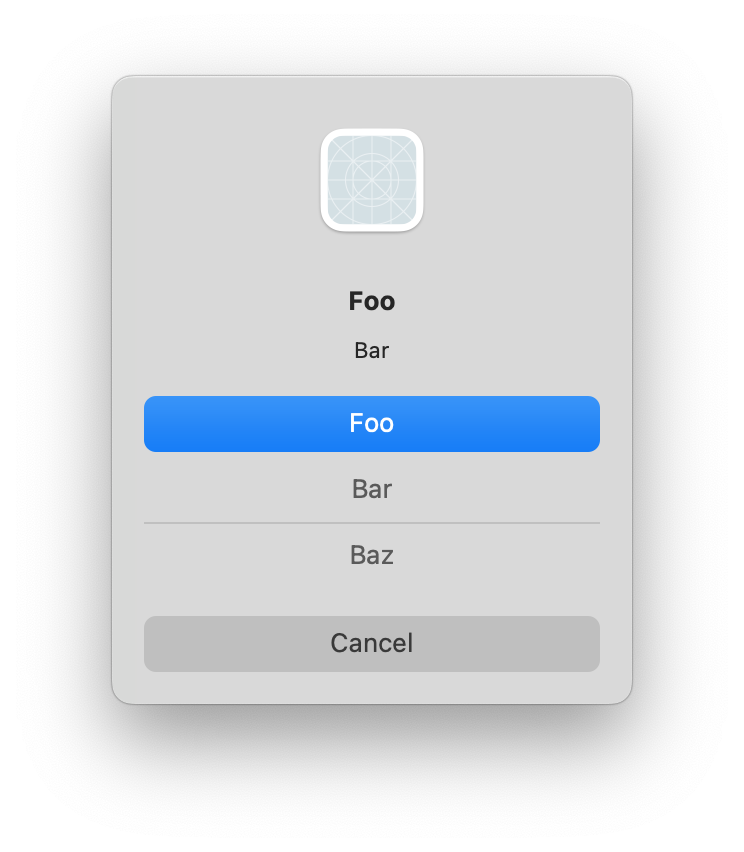
This morning my attention was grabbed by an old post in the Apple Developer Forums, bemoaning the appearance of NSAlert in Big Sur. No, not the usual complaints about alerts on Big Sur and later, but specifically about the way buttons appear when there are more than three:

Notice how the “Bar” and “Baz” buttons do not have a border or background color, making it difficult to know whether they are even buttons at all. The line between Bar and Baz clunks up the interface even more.
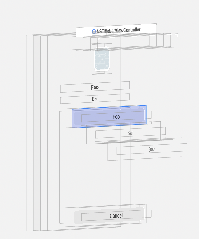
At first I thought this situation was the result of more buttons than were expected being squeezed into too small a space, but after some experimentation I discovered that even forcing the alert to give the buttons more room did not alleviate the problem. This exploded view from the Xcode view debugger shows that the top, default button, is showing the background for the button, while the other buttons don’t have one at all:

After a good amount of hacking about in the debugger, I discovered the cause was rooted in the buttons simply having their showsBorderOnlyWhileMouseInside property set to true. This suggests it’s a stylistic decision on Apple’s part, but I have to think it wasn’t completely thought through because this simply does not look good! Furthermore, that clunky line after the second button seems to be placed there as an alternative to the buttons being distinguished by their own backgrounds. It looks particularly weird to my eye, so much that it looks more like an unintended drawing glitch than an intentional interface element.
So how would you work around such a problem? As I shared in the thread on the forums, one approach that seems both safe and effective is to patch up the appearance of the buttons, and hide the unwanted line. Because NSAlert performs a great number of modifications as it’s displaying the alert, you have to subclass and override its “layout()” method to catch it after it’s done tweaking the UI:
class HackAlert: NSAlert {
  @objc override func layout() {
    super.layout()

    for button in self.buttons {
      button.showsBorderOnlyWhileMouseInside = false
    }

    if let container = self.buttons.first?.superview {
      let boxes = container.subviews.compactMap { $0 as? NSBox }
      boxes.forEach { $0.isHidden = true }
    }
  }
}
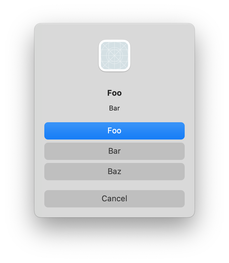
With the hack in effect, the alert looks much nicer:

The key to hacking framework shortcomings is to identify a way to make the tweak such that the desired outcome is achieved, with little risk of unwanted outcomes. The changes I made here are only likely to cause problems if, in the future, Apple redesigns the UI so that it really does make sense for these buttons to “hide their borders”, or if Apple adds additional NSBox elements to the container view that holds these buttons. These seem unlikely enough to proceed with caution, but as always you should weigh the risks yourself, and only ship what you’re comfortable with!