Category Archives: Tips

Not Applicable

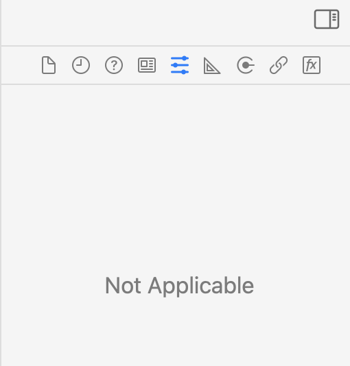
From time to time, particularly when I’m working with xib files of a certain vintage, Xcode simply refuses to offer any inspector tools for the contents of a particular Interface Builder document. Instead of the typical controls for setting an object’s properties, I get this:

UntitledImage

Look familiar? It’s super-frustrating when you simply can’t get at the settings for something you desperately need to change. I’ve sometimes gotten Xcode to relent through some combination of closing the file in question, closing assistant editors, etc. But sometimes I just can’t get it to show the properties for an object no matter what I try.

The one thing that always works is to simply make a copy of the xib file in question, which Xcode will happily edit, and then copy it back over the original. It’s really that simple:

  1. Copy MyInterface.xib to MyInterface Copy.xib
  2. Double-click the copy to edit it.
  3. Save changes.
  4. Replace MyInterface.xib with MyInterface Copy.xib

This has vexed me long and hard enough that I thought some others will not have recognized there is such an easy workaround. It would be great if Apple fixes whatever bug is causing this, but in the meantime at least there’s a solution.

Similar Detritus Not Allowed

Over the past few weeks, I’ve noticed a spike in the number of Mac and iOS developers who are running into a specific code signing error while building their apps. I myself ran into it last week after saving a new version of an image file from Preview into my app’s bundled resources.

I’ve noticed folks on Twitter and in developer Slack’s coming up with the same problem. I don’t know if something has changed in the code signing toolchain, or we’re just having an unlucky break, but I thought I’d blog about it because it seems many people may need this advice now.

The error in question is always along these lines:

resource fork, Finder information, or similar detritus not allowed

It comes up when the code signing process comes across traces of metadata in one of the files that is bundled with your app, or in some instances in the binary executable itself. This problem is common enough that Apple even posted a technical note several years ago that explains:

Code signing no longer allows any file in an app bundle to have an extended attribute containing a resource fork or Finder info.

This technical note gives advice for how to use the xattr tool to both examine and remove the unwanted extended attributes on the file. At least one colleague has reported that whatever was wrong with the file in their case was not detectable by xattr and therefore also not reparable with that tool.

Here’s a foolproof trick that is likely to address the problem, whether it’s unwanted extended attributes, resource forks, or whatever. Simply cat the affected file into another file, and then replace the original. For example, if you’ve got an image file called Whatever.png in your app, and it’s triggering the error above, try this in the Terminal:

cat Whatever.png > Whatever2.png
mv Whatever2.png Whatever.png

Et voilà! It’s as simple as that. The cat command cares not about whatever special attributes or resource forks are causing the code signing process grief. It only cares about the binary bits that comprise “the main file”.

Excluded Embedded Binaries

After updating to Xcode 11.5 my release builds started failing because a failure in the “embedded binary validation” build step, which occurs after the last explicit build phase over which we as developers have the ability to affect how products are built.

I was able to trace the problem to an attempt to validate an app extension that is embedded into my app but then removed by a later build phase. The rationale here is that the app extension in question is used internally, and shouldn’t be shipped to customers. But you can’t have dependencies and binary embedding vary based on the build configuration, so I always build the app extension, embed it, and remove it only when building a “Release” build.

This strategy has worked well for years, but in the latest Xcode, it attempts to validate the embedded binary even if it no longer exists. I guess there’s some wisdom to this. After all, a missing binary certainly isn’t valid! But historically Xcode has allowed custom build phases to substantially change the layout and contents of the built product without causing the post-build steps to fail.

I created and submitted to Apple a simple test app that exhibits the problem. In this case, an app named InvalidApp.app embeds an app extension Whatever.appex, and then removes it in a build phase. It results in this errr:

error: Couldn't load Info dictionary for <DVTFilePath:0x7f86ef4be800:'/Users/daniel/Library/Developer/Xcode/DerivedData/InvalidApp-bqvdubwezowsaccymccleomclddp/Build/Products/Debug/InvalidApp.app/Contents/PlugIns/Whatever.appex'> (in target 'InvalidApp' from project 'InvalidApp')

Yes, there is no Info.plist for this app extension because the whole thing is gone! I worried that I would have to rejigger my whole build process and figure out another way to ensure this app extension is avialable only in internal builds, but luckily Apple got back to me with a suggestion to use the EXCLUDED_SOURCE_FILE_NAMES build setting to exclude the app extension.

I am familiar with this build setting, which can be used to impose powerful variations on which source files contribute to a particular built product. For example, it can be used to cause different source files to be compiled for the iOS version of an app than the Mac version. See Dave Delong’s excellent post series on conditional compilation to learn more about this powerful technique.

But I hadn’t considered that the build setting might apply to embedded binaries. After all, Whatever.appex isn’t a “source file.” But lo and behold, adding the app extension name to the excluded source file names for my target, only in the Release build configuration, completely solves the problem. Not only does it avoid the erroneous validation error, it achieves my original goal of excluding the app extension by never copying it to the bundle in the first place. I can remove the custom build phase that selectively removed the app extension, in favor of a build setting that effectively communicates to the Xcode build system exactly what I want it to do.

Bitwise Manipulation

Since as long as I have been a programmer, bitwise operators have been an important but sometimes daunting part of my work. These are the programming tools with which you take a numerical value, let’s say seven, and manipulate it at the level of the bits that make up its binary representation. You can display the binary representation of any value in lldb, the standard Apple debugger, using “p/t”:

(lldb) p/t 7
(int) $0 = 0b00000000000000000000000000000111

One of the most common use cases for bitbwise manipulation is to squeeze lots of information into a small amount of computer memory. For example, a 32-bit integer can hold 32 distinct boolean values:

(lldb) p/t -1
(int) $1 = 0b11111111111111111111111111111111

Yep! The signed, 32-bit value for -1 is often represented as “all the bits are on!” But we could also consider this bit field to be a representation of the enabled/disabled states for 32 distinct preferences in our app. In which case, it’s common to declare numerical constants in code that make it easy to know which bit stands for what.

In C, this is often done by declaring an enumeration where each element is a different power of two, which is by definition the numeric value of each of the bits in any binary number. Apple’s own Objective-C headers use this all over the place. For example, CALayer declares a mask type that allows the four corners of a rectangle to be identified as 1, 2, 4, or 8:

typedef NS_OPTIONS (NSUInteger, CACornerMask)
{
  kCALayerMinXMinYCorner = 1U << 0,
  kCALayerMaxXMinYCorner = 1U << 1,
  kCALayerMinXMaxYCorner = 1U << 2,
  kCALayerMaxXMaxYCorner = 1U << 3,
};

To work with these types of values, you often need to use bitwise operators to set, test, unset, or toggle particular elements in a value. Working with bitwise values can be pretty brain-bending, but I recommend that everybody learn about and understand why and how each of the most common bitwise operators work. I won’t delve too deep here, but for example if you wanted to “add” the value 8, for kCALayerMaxXMaxYCorner, to an existing mask of value 7, representing all three other corners, this is what it would look like at a bitwise level:

(lldb) p/t 7
(int) $2 = 0b00000000000000000000000000000111
(lldb) p/t 8
(int) $3 = 0b00000000000000000000000000001000
(lldb) p/t 7 | 8
(int) $4 = 0b00000000000000000000000000001111

A bitwise operator acts on each bit of a value independently, potentially transforming it into a new value. The bitwise OR operator, which is “|” in C, did this above by looking at every bit in the value for 7, and every bit in the value for 8, and if either one had a value of 1, the bit in the resulting value is also set to 1. You can see this visually by playing with the operators in lldb as I’ve demonstrated above.

Even once you fully understand bitwise operators, they’re pretty annoying to work with on a day-to-day basis. That’s why in C, I’ve used these macros for years that simplify the task of performing these common tasks. I’ll leave it as an exercise to figure out why these all work the way they do:

// Basic bitwise operators for our convenience
#define RS_SET_BIT(mask, addedBit) (mask |= addedBit)
#define RS_TEST_BIT(mask, testBit) ((mask & testBit) != 0)
#define RS_CLEAR_BIT(mask, removedBit) (mask &= ~(removedBit))
#define RS_TOGGLE_BIT(mask, toggledBit) (mask ^= toggledBit)

For example, if you were maintaining a list of corner masks, and wanted to remove the kCALayerMinXMaxYCorner value, you just:

CACornerMask existingCornerMask = ... whatever ...
RS_CLEAR_BIT(existingCornerMask, kCALayerMinXMaxYCorner);

It’s more readable, easier to remember, and most importantly easier to get right than always coming up with the exact combination of bitwise operations to remove a value from a binary bitmask.

What about Swift? These macros are based on C’s macro preprocessor, and Swift doesn’t support such a thing. The good news is Swift handles bitmasks in a fundamentally better way, by promoting them to a first-class type called OptionSet. If you’re lucky enough to be working in Swift, you can achieve the same thing as above with:

var existingCornerMask: CACornerMask = ... whatever ... 
existingCornerMask.remove(.layerMinXMaxYCorner)

Bitwise manipulation is important in most every field of computer programming, and as I said, you should really understand it. But as I also said, once you’ve understood it, you should probably strive to never use bitwise operators again. At least not directly.
Supporting Dark Mode: In-App Web Content

If you’re using a web view the way a browser does, to show arbitrary content from the web, then you probably don’t need to do anything special to accommodate Dark Mode. If Dark Mode takes off then maybe we’ll see some kind of CSS standard around presenting web sites for dark presentations, but for the time being users expect web pages to look … like web pages.

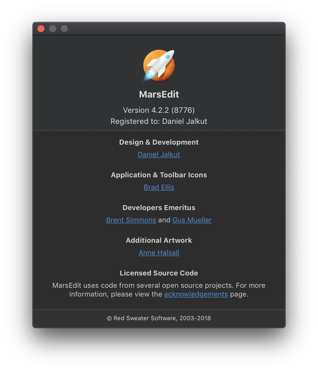
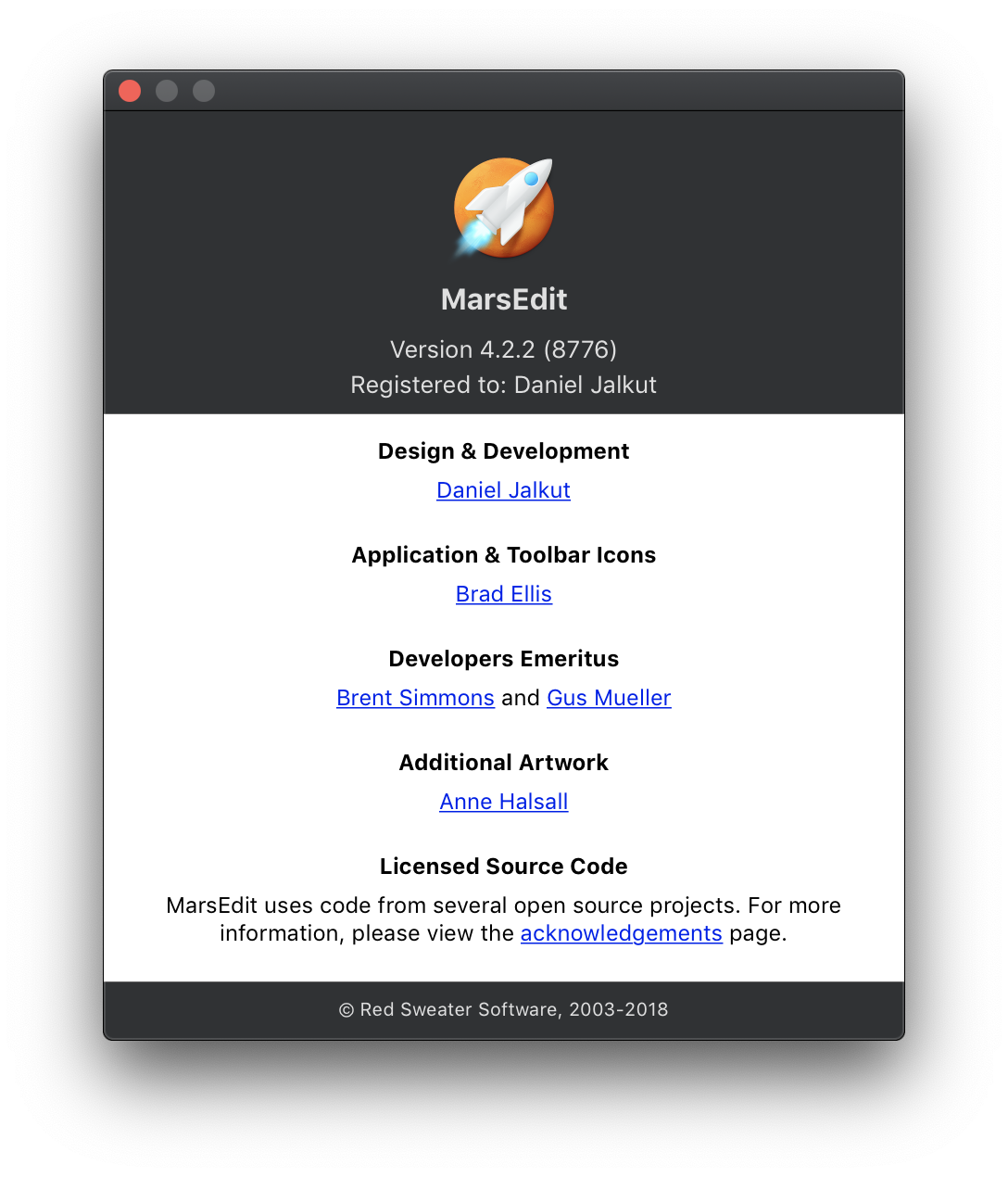
On the other hand if you’re using web views to support an otherwise native Mac user interface, you’ll want to do something to adapt the default styling of your web content to look appropriate in Dark Mode. For example, I use a web view in my standard about box window. Here’s how it looked in MarsEdit before I adapted any web content to Dark Mode:

Screenshot of MarsEdit's about box with undarkened HTML content.

The two-tone look is kind of cool, but too much of an assault on the eyes for anybody who has really settled into Dark Mode. This content is not like a web page. It’s implemented in HTML to make features such as styling, layout, and links easier to manage, but as far as users are concerned it’s an innate part of this native About Box window.

I’ve seen a few approaches to adapting web content to Dark Mode, but most of them relied too heavily on modifying the actual HTML content that was being shown. In my apps, I use web views in several places and, rather than have to jump through hoops in each place to finesse the content for Dark Mode, I thought it would be better if I could come up with a common infrastructure that all web content presenters could use without typically being concerned about appearance.

Because my app is using both legacy WebView and modern WKWebView, I had to duplicate my efforts to some extent, but for the purposes of this article I’m going to focus on the approach I took for WKWebView.

My solution is rooted in arranging for a web view to call a pertinent JavaScript function when the effective appearance changes. Because WKWebView instances are notified via the viewDidChangeEffectiveAppearance method, I decided to subclass WKWebView to fulfill this contract on behalf of clients:

class RSAppearanceSensitiveWKWebView: WKWebView {

   var didInitialize = false

   // Override designated initializers to record when we're
   // done initializing, and avoid evaluating JS until we're done.

   override init(frame: CGRect, configuration: WKWebViewConfiguration) {
      super.init(frame: frame, configuration: configuration)
      didInitialize = true
   }

   required init?(coder: NSCoder) {
      super.init(coder: coder)
      didInitialize = true
   }

   public func updateContentForEffectiveAppearance() {
      // Don't try updating anything until we're done loading
      if didInitialize && self.isLoading == false {
         let funcName: String
         if self.effectiveAppearance.isDarkMode {
            funcName = "switchToDarkMode"
         }
         else {
            funcName = "switchToLightMode"
         }

         // Call the named function only if it is implemented
         let switchScript = "if (typeof(\(funcName)) == 'function') { \(funcName)(); }"
         self.evaluateJavaScript(switchScript)
      }
   }

   override func viewDidChangeEffectiveAppearance() {
      self.updateContentForEffectiveAppearance()
      if #available(macOS 10.14, *) {
         super.viewDidChangeEffectiveAppearance()
      }
   }
}

Instances of this subclass enjoy the benefit of two JavaScript functions, switchToDarkMode() and switchToLightMode(), being called whenever the view’s effective appearance changes. In case a client doesn’t wish the content to be adapted to Dark Mode, they can simply omit the functions from the content they load into the view.

Because I don’t want to duplicate efforts to handle appearance switching throughout my apps, I implemented basic support for mode switching in my centralized “web content display” class, RSWebContentViewController. This controller takes advantage of WKWebView’s support for injecting JavaScript, to add support for switching modes to whatever content the client provided:

let appearanceModeScriptSource = """
   var darkModeStylesNodeID = "darkModeStyles";

   function addStyleString(str, nodeID) {
      var node = document.createElement('style');
      node.id = nodeID;
      node.innerHTML = str;

      // Insert to HEAD before all others, so it will serve as a default, all other
      // specificity rules being equal. This allows clients to provide their own
      // high level body {} rules for example, and supersede ours.
      document.head.insertBefore(node, document.head.firstElementChild);
   }

   // For dark mode we impose CSS rules to fine-tune our styles for dark
   function switchToDarkMode() {
      var darkModeStyleElement = document.getElementById(darkModeStylesNodeID);
      if (darkModeStyleElement == null) {
         var darkModeStyles = "body { color: #d2d2d2; background-color: #2d2d2d; } body a:link { color: #4490e2; }";
         addStyleString(darkModeStyles, darkModeStylesNodeID);
      }
   }

   // For light mode we simply remove the dark mode styles to revert to default colors
   function switchToLightMode() {
      var darkModeStyleElement = document.getElementById(darkModeStylesNodeID);
      if (darkModeStyleElement != null) {
         darkModeStyleElement.parentElement.removeChild(darkModeStyleElement);
      }
   }
"""

let appearanceModeScript = WKUserScript(source: appearanceModeScriptSource, injectionTime: .atDocumentEnd, forMainFrameOnly: true)
self.webView.configuration.userContentController.addUserScript(appearanceModeScript)

Copy this into Xcode for easier reading, but the gist of it is to implement switchToDarkMode() by injecting CSS rules that alter the baseline defaults for the web content, and implement switchToLightMode() by removing those CSS rules. This is what my about box looks like after adopting the changes above:

Screenshot of MarsEdit's about box window after the HTML content has been adapted to Dark Mode

This approach requires clients of RSWebContentViewController to trust that the default appearance switching will be sufficient for whatever content it wants to display. So far this simple approach has been sufficient for my needs, but I’m also in a good position to expand upon the solution should the need arise.

Supporting Dark Mode: Adapting Images

When Apple announced Dark Mode at WWDC 2018, one of my first thoughts was: “Aha! So that’s why Apple has us all switching our icons to template (monochrome) style images.” These images do tend to adapt pretty well to Dark Mode because the system can simply invert them and obtain a fairly usable icon, but the crude inversion doesn’t work well in all cases.

There are a lot of details to really getting Dark Mode icons perfect, and Apple talks a lot about this in the Introducing Dark Mode WWDC session. Given my limited time and resources, I took a pragmatic approach to get things looking “good enough” so I could ship a cohesive project while I hope to continue working on refinements in the future.

As with colors, asset catalogs can be a great aid in managing image variations for different appearances. Use them if you can, but bear in mind the caveats mentioned in the Adapting Colors section of this series.

Most apps will probably require some refinement of toolbar icons, the row of images typically displayed at the top of some windows. In MarsEdit, I was in pretty good shape thanks to a recent overhaul for MarsEdit 4, in which Brad Ellis revised my toolbar icons. Many, but not all, of the images have a templated style aesthetic. Here’s MarsEdit’s main window in Light Mode:

Screenshot of MarsEdit 4's main window toolbar in Light Mode

Let’s see what happens when just switch to Dark Mode without any special care for the icons:

Screenshot of MarsEdit 4's main window toolbar in Dark Mode without any special finessing

That’s … not so good! Even my vaguely template-style icons are not being treated as templates, so they render with their literal gray colors and look pretty bad in Dark Mode. I realized I could probably do some quick Acorn work and get the template-style icons into shape, but what about the ones with splashes of color? The pencil? Should it still be yellow in Dark Mode?

I opted for a pragmatic, stop-gap solution. Without making any changes whatsoever to the graphics files, I worked some magic in code and came up with this:

Screenshot of MarsEdit 4's main window toolbar in Dark Mode with some finessing

That’s … actually pretty good! So what’s the magic in code I alluded to? I created a custom subclass of NSButton that will optionally set template status on the button’s image only if we’re in Dark Mode. You can see that some of the icons I’ve left untouched, because I felt their colors fit well enough in both dark and light modes. Here’s my custom RSDarkModeAdaptingToolbarButton:

class RSDarkModeAdaptingToolbarButton: NSButton {
   public var useTemplateInDarkMode: Bool = false
   var originalTemplateFlag: Bool = false

   public convenience init(image: NSImage, 
                           target: Any?, 
                           action: Selector?,
                           useTemplateInDarkMode: Bool = false) {
      self.init(image: image, target: target, action: action)
      self.useTemplateInDarkMode = useTemplateInDarkMode
   }

   override func layout() {
      // Always re-set the NSImage template state based
      // on the current dark mode setting
      if #available(macOS 10.14, *) {
         if self.useTemplateInDarkMode,
            let targetImage = self.image
         {
            var newTemplateState = self.originalTemplateFlag

            if self.effectiveAppearance.isDarkMode {
               newTemplateState = true
            }

            targetImage.isTemplate = newTemplateState
         }
      }

      super.layout()
   }
}

The key to this button’s functionality is the guarantee that layout will always be called on a button after an appearance change has occurred. This gives the button the opportunity to configure properties on itself that will affect how it is drawn. Sneaking in to set the template state on the image guarantees the NSButton superclass drawing code will treat it as a template in Dark Mode, but as a bitmap image in Light Mode.

Supporting Dark Mode: Appearance-Sensitive Preferences

One of the challenges I dealt with in MarsEdit was how to adapt my existing user-facing color preferences to Dark Mode:

Screenshot of MarsEdit's preferences for text foreground and background colors.

The default values and any previously saved user customizations would be pertinent only to Light Mode. I knew I wanted to save separate values for Dark Mode, but I worried about junking up my preferences panel with separate labels and controls for each mode. After playing around with some more complicated ideas, I settled on simplicity itself: I would register and save separate values for each user-facing preference, depending on whether the app is in Dark Mode right now.

When a user switches modes, the visible color preferences in this panel change to the corresponding values for that mode. I reasoned that users are most likely to use these settings to fine-tune the appearance of the app as it appears now, and it would be intuitive to figure out if they wanted to customize the colors separately for each mode.

How did I achieve this? I decided to bottleneck access to these preferences so that as far as any consumer of the preference is concerned, there is only one value. For example, any component of my app that needs to know the “text editing color” consults a single property “bodyTextColor” on my centralized preferences controller. This is what the supporting methods, along with the property accessor, look like:

func color(forKey key: String, defaultColor: NSColor) -> NSColor {
   let defaults = UserDefaults.standard
   guard let color = defaults.rsColor(forKey: key) else {
      return defaultColor
   }
   return color
}

func setColor(color: NSColor, forKey key: String) {
   let defaults = UserDefaults.standard
   defaults.rsSetColor(color, forKey: key)
}

var bodyTextPreferenceKey: String {
   if NSApp.isDarkMode {
      return bodyTextColorForDarkModeKey
   } else {
      return bodyTextColorForLightModeKey
   }
}

@objc var bodyTextColor: NSColor {
   get {
      let key = self.bodyTextPreferenceKey
      return self.color(forKey: key, defaultColor: .textColor)
   }
   set {
      let key = self.bodyTextPreferenceKey
      self.setColor(color: newValue, forKey: key)
      self.sendNotification(.textColorPreferenceChanged)
   }
}

Because the getter and setter always consult internal properties to determine the current underlying defaults key, we always write to and read from the semantic value that the user expects. The only thing the user interface for my Preferences window needs to do is load up the color pane with the value from the getter, and respond to changes by writing with the setter.

You might be wondering what happens to the Preferences interface when the application’s appearance changes. I thought at first I would make the UI controller subscribe to appAppearanceChanged notifications, and reload the contents of the UI to match the current values of pertinent color preferences. It turned out that I didn’t even need to do that. Why?

In my centralized preferences controller, where the bottleneck methods shown above are implemented, each of the pertinent setters sends a notification that the color preference has changed. This allows observers throughout the app to update the color as needed when, for example, the user chooses a new value. If you’re using KVO or another technique for notifying clients of changes, this same approach can be adapted to that style.

After ensuring that all clients are notified when a color preference “changes,” we can reuse that same mechanism to proliferate changes in color preferences that happen to correlate with a change in appearance mode. I simply added an observer to “appAppearanceChanged” within the preference controller, where such notifications are translated into “color preference changed” notifications. The Preferences window observes these, and updates the UI. My text editors notice them, and reconfigure their appearance. Every concerned component of my app is guaranteed to know current colors regardless of how or why they have changed.

It’s worth noting that this is a scenario where using a solution like appearance-sensitive colors might also make sense. Instead of taking responsibility for notifying clients whenever these preferences change, a single color instance that adapts to current appearance would get the job done. This is a situation where even using an asset catalog doesn’t help. Because the colors in this situation are user-generated at run-time, they can’t be stored in a catalog, but a custom subclass of NSColor could achieve the same effect.

Supporting Dark Mode: Adapting Colors

Given the dramatic visual differences between appearances, virtually every color in your app will need to be varied at drawing time to work well with the current appearance.

Use Semantic Colors

The good news is all of Apple’s built-in, semantically named colors are automatically adapted to draw with a suitable color for the current appearance. For example, if you call “NSColor.textColor.set()” in light mode, and draw a string, it will render dark text, whereas in dark mode it will render light text.

Seek out areas in your app where you use hard-coded colors and determine whether a system-provided semantic color would work just as well as, or better than, the hard-coded value. Among the most common fixes in this area will be locating examples where NSColor.white is used to clear a background before drawing text, when NSColor.textBackgroundColor will do the job better, and automatically adapt itself to Dark Mode.

Vary the Color at Drawing Time

In scenarios where a truly custom color is required, you have a few options. If the color is hard-coded in a drawing method, you may be able to get away with simply querying NSAppearance.current from the point where the drawing occurs. For example, a custom NSView subclass that simply fills itself with a hard-coded color:

override func draw(_ dirtyRect: NSRect) {
   super.draw(dirtyRect)

   // Custom yellow for light mode, custom purple for dark...

   let lightColor = NSColor(red:1, green:1, blue:0.8, alpha:1)
   let darkColor = NSColor(red:0.5, green:0.3, blue:0.6, alpha:1)

   if NSAppearance.current.isDarkMode {
      darkColor.setFill()
   } else {
      lightColor.setFill()
   }

   dirtyRect.fill()
}

Use Asset Catalogs

Special cases like above are fine when you draw your own graphics, but what about views that the system frameworks draw for you? For example, because NSBox supports drawing a custom background color, you’re unlikely to implement a custom view exactly like the one above. Its functionality is redundant with what NSBox provides “for free.” But how can you ensure that NSBox will always draw in the right color for the current appearance? It only supports one “fillColor” property.

A naive approach would involve paying attention to changes in appearance, and re-setting the fill color on NSBox every time. This would get the job done, but is more complicated and error-prone than simply setting a named system color like “textBackgroundColor” and letting it handle all the details of accommodating the current appearance.

Luckily, Apple provides a mechanism for adding custom named colors that behave the same way as standard colors do. Colors that are included in an asset catalog can be identified by name, and can be varied in the catalog to represent distinct colors depending on the appearance they are used in. In short, by defining all your hard-coded colors in asset catalogs, you can treat custom named colors like “funkyBackgroundColor” the same as standard colors like “textBackgroundColor.”

Ah, but there’s a catch. To take advantage of these fancy new asset catalog features, you need to not only build your app with Xcode 10, but you need to build it on a machine that is running macOS 10.14 or greater. Evidently the ability to generate suitable asset catalogs depends on some system functionality that Xcode 10 can’t (or at least doesn’t) replicate when running on 10.13. If you try to use these features in Xcode 10 on 10.13, you’ll run into warnings like:

warning: Named colors referencing system colors must be compiled on 10.14 to maintain dynamic behavior at runtime. Using fixed values for color 'textColor'

and

Varying images and colors by appearance requires building on macOS 10.14 or later.

Because of the utility of asset colors for both colors and images, I strongly recommend updating to Xcode 10 and building on 10.14.

Appearance-Sensitive Colors

If for some reason you can’t yet build your app with Xcode 10 on macOS 10.14, you might eke out a stopgap solution similar to mine. Because I started adopting Dark Mode shortly after WWDC 2018, before Xcode 10 or macOS 10.14 were final, I felt I needed something to simulate the behavior of catalog colors, but implemented independently of them.

I developed a class for my apps called RSAppearanceSensitiveColor, a subclass of NSColor that wraps multiple colors. If you decide to do something similar, be sure to take a look at the subclassing notes in NSColor’s documentation to ensure you override all the required methods. The most functionally important methods to override are “set”, “setFill”, and “setStroke”, because these methods are called at runtime by code that is responsible for drawing. If, for example, you implement a subclass that stores “lightModeColor” and “darkModeColor” as variants, you could add an internal helper method to resolve it:

var currentColor: NSColor {
   if NSAppearance.current.isDarkMode {
      return self.darkModeColor
   }
   else {
      return self.lightModeColor
   }
}

This takes advantage of the NSAppearance.isDarkMode property I described in Checking Appearances, making it easy to specialize based on the current appearance. Remember: that’s the one that is currently being used to perform drawing, etc. When a client that is configured with one of our colors, NSBox for example, calls our set() before drawing its background:

override public func set() {
   self.currentColor.set()
}

The actual drawing color will be appropriate for the current appearance, just as with Apple’s semantic and catalog-backed colors.

Supporting Dark Mode: Responding to Change

To support Dark Mode elegantly in your app, you need to not only initialize your user interface appropriately for the current appearance, but also be prepared to adapt on the fly if the user changes appearance after your interface is already visible on the screen.

In situations where you use semantic colors or consult the current appearance at drawing time, there’s nothing else to be done. Since changing the appearance invalidates all views on the screen, your app will redraw correctly without any additional intervention.

Other situations may demand more customized behavior. I’ll give a couple examples later in this series, but for now just take my word that you may run into such scenarios.

If you have a custom view that needs to perform some action when its appearance changes, the most typical way to handle this is by implementing the “viewDidChangeEffectiveAppearance” method on NSView. This is called immediately after your view’s effectiveAppearance changes, so you can examine the new appearance, and update whatever internal state you need to before subsequent drawing or event handling methods are called:

class CustomView: NSView {
   override func viewDidChangeEffectiveAppearance() {
      // Update appearance related state here...
   }
}

If you need to react to appearance changes in the context of an NSViewController, your best bet may be to use Key Value Observing (KVO) to observe changes to the “effectiveAppearance” property on the view controller’s view. This approach will set your view controller up to be notified around the same time the view itself would be.

In some situations it’s more interesting to know whether, at a high level, the application’s appearance has shifted in a significant way. For this you can observe “effectiveAppearance” on the NSApplication.shared instance. There is no standard NotificationCenter notification for this, but I found it useful enough in my code bases that I added my own.

By centralizing KVO observation of NSApp.effectiveAppearance, I can translate all such changes into NotificationCenter-based broadcasts that any component of my app can observe. To implement something like this, first declare an NSNotification.Name extension in some high-level class such as your application delegate:

extension NSNotification.Name {
   public static let appAppearanceChanged =
      NSNotification.Name("appAppearanceChanged")
}

Then implement the centralized KVO somewhere early in launch, such as in applicationDidFinishLaunching:

observer = NSApp.observe(\.effectiveAppearance) { (app, _) in
   let nc = NotificationCenter.default
   nc.post(name: .appearanceChanged, object: app)
}

Now any code in your app that needs to be alerted when the app changes appearance can observe NSNotification.Name.appAppearanceChanged and respond by adjusting whatever it needs to.

Supporting Dark Mode: Checking Appearances

As you adapt your app to support Dark Mode, you may run into situations where you need to determine, in code, what the active appearance is. This is most typical in custom views that vary their drawing based on the current appearance, but you may also need to test higher level appearance traits to determine, for example, whether the whole application is being run “in Dark Mode” or not.

Current and Effective Appearances

To work effectively with Dark Mode support, you must appreciate the distinction between a few key properties that are all of type NSAppearance. Take some time to read the documentation and watch the videos I referenced in Educational Resources, so you really understand them. Here is a capsule summary to use as reference in the context of these articles:

  • appearance is a property of objects, such as NSApplication, NSWindow, and NSView, that implement the NSAppearanceCustomization protocol. Any such object can have an explicit appearance deliberately set on it, affecting the appearance of both itself and any objects that inherit appearance from it. As a rule, views inherit the appearance of their window, and windows inherit the appearance of the app.
  • effectiveAppearance is a property of those same objects, taking into account the inheritance hierarchy and returning a suitable appearance in the likely event that no explicit value has been set on the object.
  • NSAppearance.current or +[NSAppearance currentAppearance] is a class property of NSAppearance that describes the appearance that is currently in effect for the running thread. Practically speaking you can think of this property as an ephemeral drawing variable akin to the current fill color or stroke color. Its value impacts the manner in which drawing that is happening right now should be handled. Don’t confuse it with high-level user-facing options about which mode is set for the application as a whole.

High-Level Appearance Traits

As you modify your code to respect the current or effective appearance, you will probably need to make high level assessments like “is this appearance light or dark?” Because of the aforementioned complication that there are many types of NSAppearance, that they can be nested, etc., it’s not possible to simply compare the current appearance with a named appearance. Instead, you use a method on NSAppearance designed to evaluate which high-level appearance it is most like. If it’s a matter of simply distinguishing between light and dark appearances, you can use something like this:

let mode = NSAppearance.current
let isDark = mode.bestMatch(from: [.darkAqua, .aqua]) == .darkAqua

In my applications, I found myself testing NSAppearance instances for lightness or darkness commonly enough that I implemented an “isDarkMode” property in an extension to NSAppearance:

// NSAppearance extension

@objc(rsIsDarkMode)
public var isDarkMode: Bool {
   let isDarkMode: Bool

   if #available(macOS 10.14, *) {
      if self.bestMatch(from: [.darkAqua, .aqua]) == .darkAqua {
         isDarkMode = true
      } else {
         isDarkMode = false
      }
    } else {
        isDarkMode = false
    }

    return isDarkMode
}

As you can see this is laden with the requisite tests to ensure it works even if the app is running on a pre-10.14 Mac. A nice side-effect of centralizing this code in one place, is eliminating the need to include those checks at every call point.

This helper method is handy for working with NSAppearance instances, but in some contexts what I really want to know is bluntly: is this app running in dark mode or not? To accommodate this, I extend NSApplication to offer an identically named property:

// NSApplication extension

@objc(rsIsDarkMode)
public var isDarkMode: Bool {
   if #available(macOS 10.14, *) {
      return self.effectiveAppearance.isDarkMode
   } else {
      return false
   }
}

This method takes advantage of NSAppearance.isDarkMode, so it doesn’t have to replicate any of the important, but slightly clumsy “bestMatch” code either.

Having these convenient methods at my fingertips has been a great aid because it allows me to quickly answer the high-level question of whether an appearance is dark or not, regardless of whether I’m implementing drawing code or making a higher-level semantic interpretation of the application’s user-facing appearance.