I love the macOS system-wide dictionary lookup feature. If you’re not familiar with this, just hold down the Control, Command, and D keys while hovering with the mouse cursor over a word, and the definition appears. What’s amazing about this feature is it works virtually everwyhere on the system, even in apps where the developers made no special effort to support it.
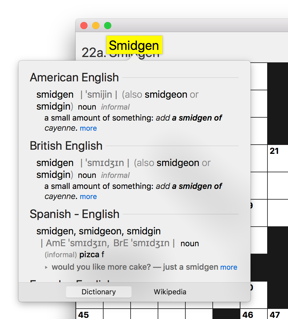
Occasionally, while solving a crossword puzzle in my own Black Ink app, I use this functionality to shed some light on one of the words in a clue. As alluded to above, it “just works” without any special work on my part:

Look carefully at the screenshot above, and you can see that although the dictionary definition for “Smidgen” appears, it seems to have highlighted the word in the wrong location. What’s going on here?
The view in Black Ink that displays the word is a custom NSTextField subclass called RSAutosizingTextField. It employs a custom NSTextFieldCell subclass in order to automatically adjust the font size and display position to best “fill up” the available space. In short: it behaves a lot like UITextField on iOS.
To achieve this behavior, one of the things my custom cell does is override NSTextFieldCell’s drawingRect(forBounds:). This allows me to take advantage of most of NSTextField’s default drawing behavior, but to nudge things a bit as I see fit. It’s this mix of customized and default behaviors that leads to the drawing bug seen above. I’ve overridden the drawing location, but haven’t done anything to override the content hierarchy as it’s reflected by the accessibility frameworks.
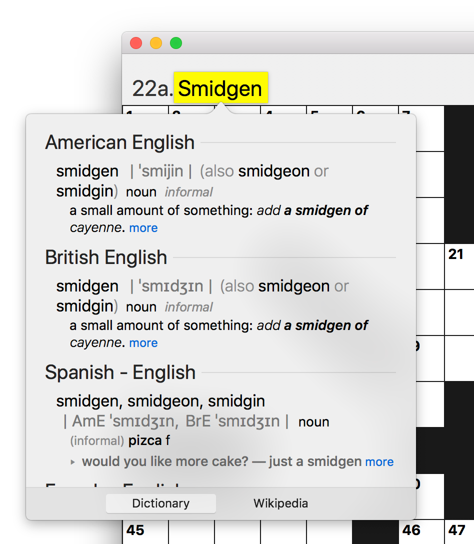
What do the accessibility frameworks have to do with macOS system-wide dictionary lookup? A lot. Apparently it’s the “accessibilityFrame” property that dictates not only where the dictionary lookup’s highlighting will be drawn, but also whether the mouse will even be considered “on top of” a visible word or not. So in the screenshot above, if the mouse is hovering over the lower half of the word “Smidgen”, then the dictionary lookup doesn’t even work.
The fix is to add an override to NSTextField’s accessibilityFrame method:
public override func accessibilityFrame() -> NSRect {
	let parentFrame = super.accessibilityFrame()
	guard let autosizingCell = self.cell as? RSAutosizingTextFieldCell else { return parentFrame }

	let horizontalOffset = autosizingCell.horizontalAdjustment(for: parentFrame)

	// If we're flipped (likely for NSTextField, then the adjustments will be inverted from what we
	// want them to be for the screen coordinates this method returns.
	let flippedMultiplier = self.isFlipped ? -1.0 as CGFloat : 1.0 as CGFloat
	let verticalOffset = flippedMultiplier * autosizingCell.verticalAdjustment(for: parentFrame)

	return NSMakeRect(parentFrame.origin.x + horizontalOffset, parentFrame.origin.y + verticalOffset, parentFrame.width, parentFrame.height)
}
Effectively I take the default accessibility frame, and nudge it by the same amount that my custom autosizing text cell is nudging the content during drawing. The result is only subtly difference, but makes a nice visual refinement, and a big improvement to usability:

I thought this was an interesting example of the accessibility frameworks being leveraged to provide a service that benefits a very wide spectrum of Mac users. There’s a conventional wisdom about accessibility that emphasizing the accessibility of apps will make the app more usable specifically for users who take advantage of screen readers and other accommodations, but more generally for everybody who uses the app. This is a pretty powerful example of that being the case!