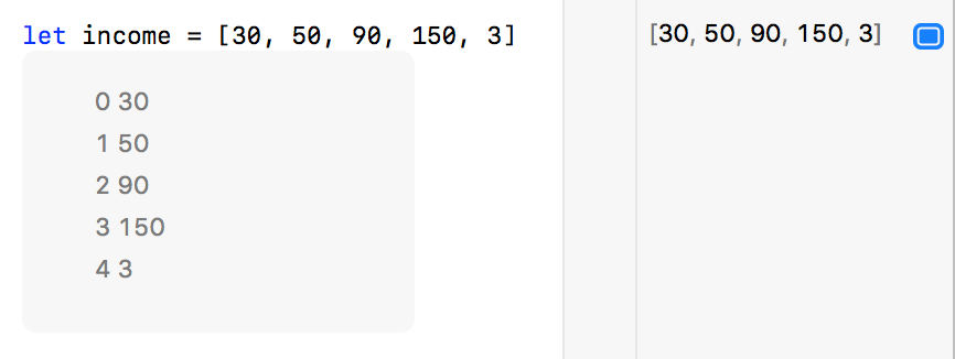
I was playing around with the Swift standard library’s “map” function, when I noticed a cool feature of Xcode Playgrounds. Suppose you are working with an array of numbers. In the Xcode Playgrounds “results” section, you can either click the Quick Look “eye” icon, or click the little results rectangle to get an inline results view of the expression you’re viewing:

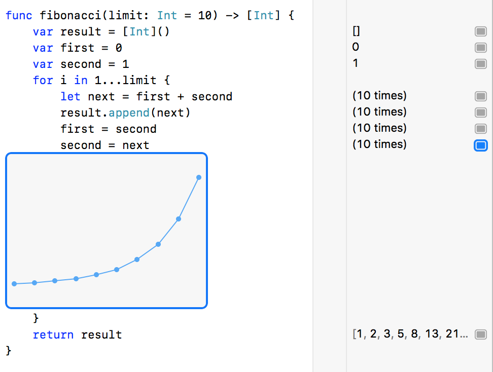
The linear list of values is revelatory and easy to read, but wouldn’t it be easier to understand as a graph? It turns out simply passing these values through the map function does just that:

I thought I had stumbled on some magical secret of Xcode, but it turns out the behavior is well documented, and applies to more than just the “map” function. You can even grab the edges of the result view and resize it to better suit your data. In fact, any looping numeric value seems to trigger the availability of this handy graphing functionality:

I am still frustrated by a lot of behaviors of Xcode Playgrounds, but little gems like these are nice to stumble upon.